top of page
Toast Capital
Providing restaurant owners access to loans to help them grow their business
🏢 Company
Toast
🗓 Duration
7 months (2021-2022)
👨🏻💻 Role
Design lead
🧐 Responsibilities
Research, Product Strategy, UX, UI
👨👩👧👧 Team
PM, UX researcher, Engineers, Legal, QA
INTRODUCTION
I led the redesign of the entire loan process in Toast Capital. Our team sought to humanize the loan experience and make loans accessible to all restaurant owners. This effort would help customers get access to a tailored capital product to fit their financial needs so that it can fuel their business.
MY ROLE
As the Lead product designer, I led research initiatives, facilitated design workshops, generated design strategy, and created mock-ups/wireframes/prototypes. I worked collaboratively with PM, Engineers, UX researcher, Legal, and QA throughout this project.
PROBLEM
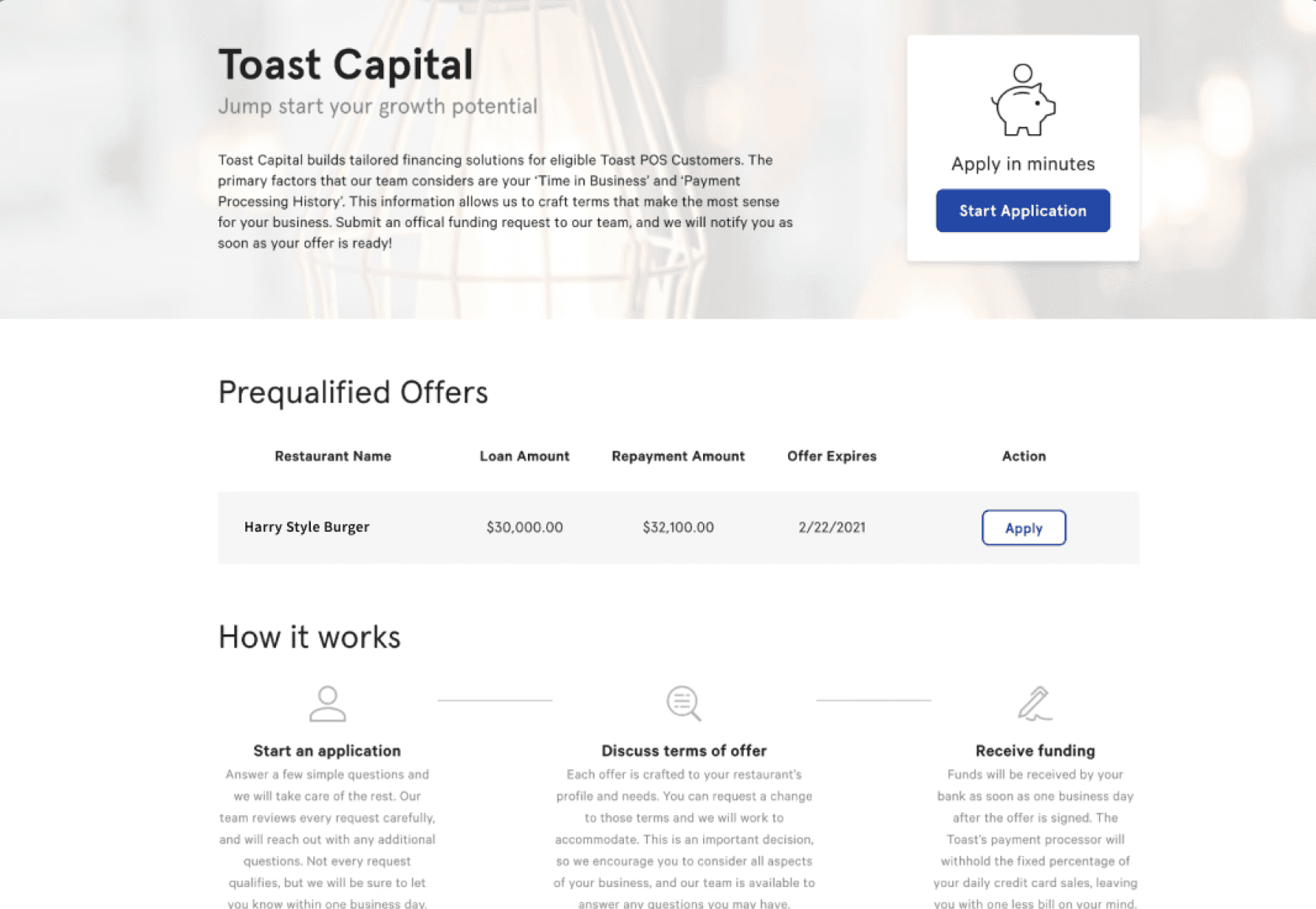
Many restaurant owners find it challenging to get access to Toast Capital loan. This was evident as it recorded a high 43% bounce rate on the offer page. Hence, we witnessed a steady decrease in attach rate, NPS score (customer satisfaction rate, and ARR from loan origination.
SOLUTION
Provide financial education and humanize the loan experience by giving customers control over their debt and understanding the tradeoffs between costs, time, and risk. By doing so, it satisfies the specific custom financial needs of more users, ultimately growing attach rate, ARR from loan origination, and NPS score (customer satisfaction rate).
IMPACT
The customer reception to our sweeping changes was positive. While it took some customers some time to become familiar with the new interactions, customers satisfaction scores increased and we hit our business goals.
PROCESS
UNDERSTAND THE USERS
The first step was to understand who the users were and their process of approaching and applying for capital loans. UX researcher, PM, and I conducted generative research to corroborate the findings and develop a better perspective of restaurant owners. Those sessions led to several important findings:
👉🏼 Most SMB restaurants are less than 5 years with low credit scores and history
👉🏼 SMB restaurants are poorly served by predatory financial products that impose unfair and abusive loan terms and high-interest rates
👉🏼 Lending transparency is imperative for small business restaurant owners
👉🏼 Their level of financial literacy is below average
CONTEXTUAL INQUIRY
Our lead ux researcher kicked off research with a series of field interviews. I joined her as we held conversations with both Toast customers and non-Toast customers. Those sessions led to several important findings:
👉🏼 Unfamiliarity with Toast Capital was the #1 reason why customers haven’t applied.
(need to learn more + unsure of fit)
👉🏼 Customers find it very difficult to understand the fee, rate, or other terms.
👉🏼 Customers have concerns and uncertainty around their financial ability to pay off their loans
DESIGN WORKSHOP
I led the design efforts of the loan offer dashboard. I ran a team design workshop in which participants (designers, researchers, engineers, marketing and PM) were encouraged to sketch 8 ideas in 8 minutes in order to generate a pool of ideas from which we could further evaluate.
DIVERGING ON SOLUTIONS
📌 Value propositions to help customers better understand Toast Capital loan and find their fit
📌 Easy-to-understand financial terms with tooltips to boost customer confidence regardless of their financial literacy and background
📌 More flexibility into crafting their loan so that customers have control over their debt
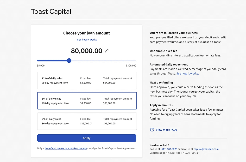
Design A
🧐 Hypothesis: Minimizing choices and options to three offers will help customers make better educated choice and decrease decision time
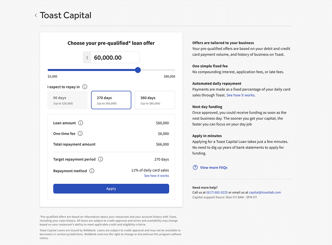
Design B
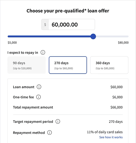
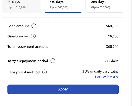
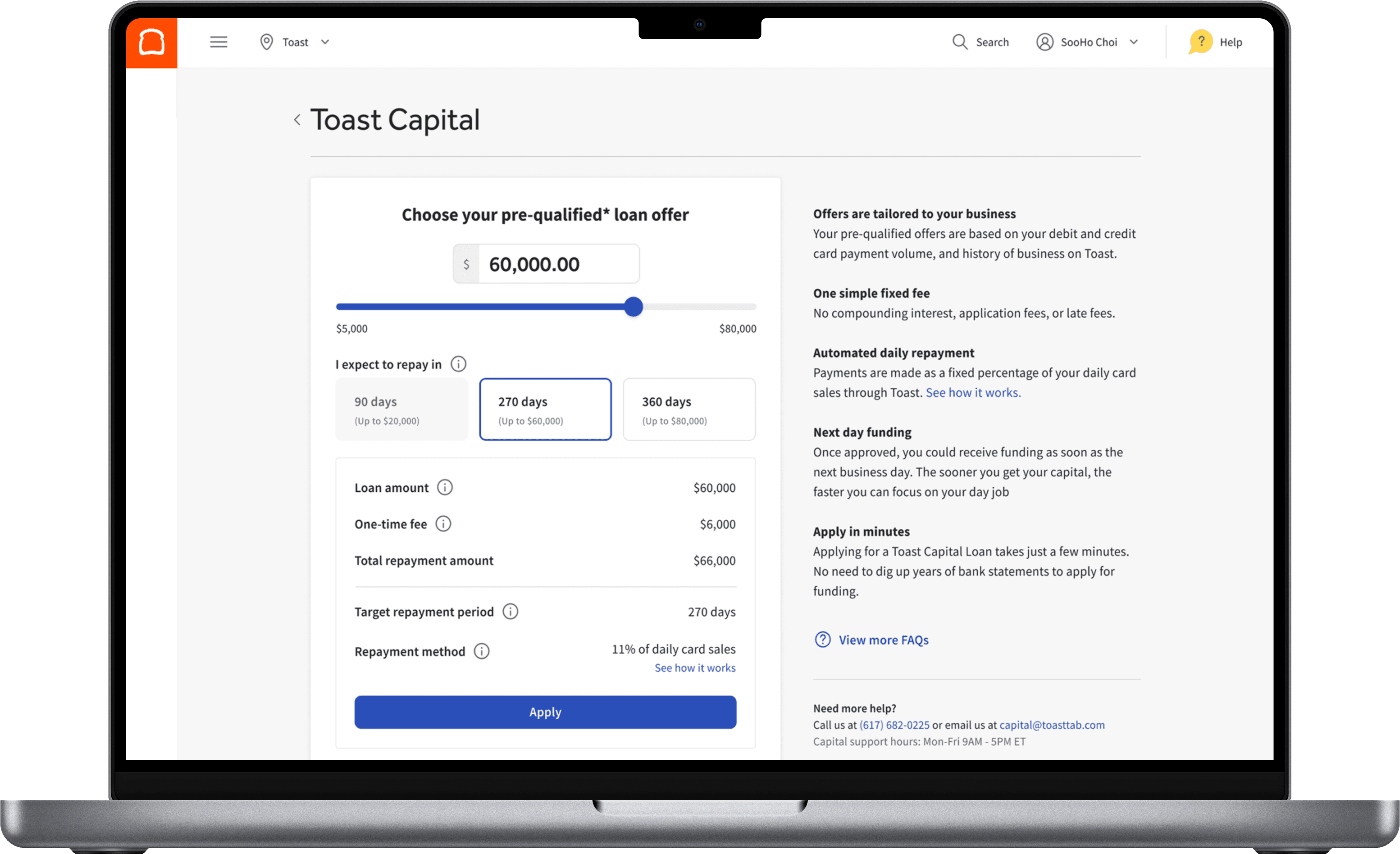
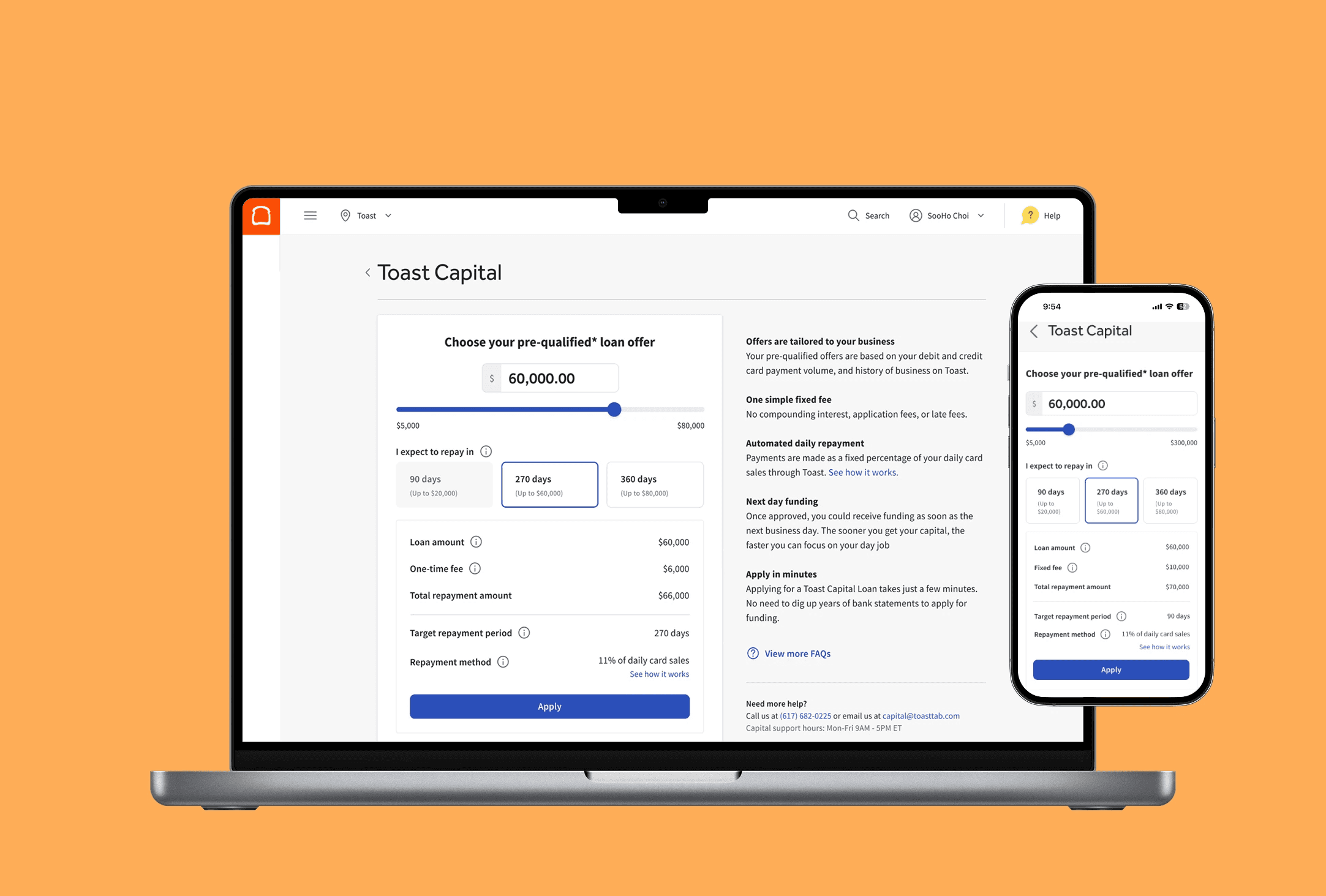
🧐 Hypothesis: Offering more choices with limitations will help customers have more control over their debt and understand the tradeoffs between costs, time, and risk. Hence, users will have better-educated choices and decrease decision time.
A/B TESTING
During ideation, there was an alternative idea that various stakeholders fell strongly about.
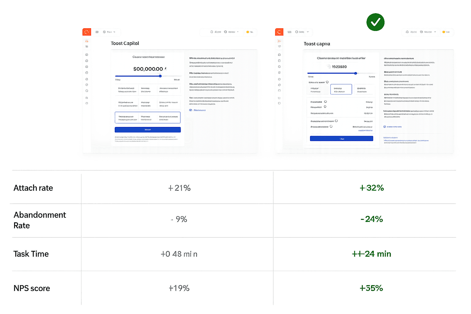
Given the debate, we conducted a 50:50 split A/B testing to validate our hypothesis and to see which design performed better over the course of 5 weeks. These were the KPIs:
🎯 Attach rate (number of applications)
🎯 Abandonment Rate
🎯 Task Time
🎯 NPS score (customer satisfaction rate)
FINAL DESIGN
After conducting the A/B testing, I narrowed in on a design that outperformed in most metrics. Research demonstrated that the design B struck the right balance between financial education and customization. We went through a couple more rounds of internal feedback and feature prioritization with the team and eventually launched GA.
IMPACT
The customer reception to our sweeping changes was positive. While it took some customers some time to become familiar with the new interactions, customers satisfaction scores increased and we hit our business goals.
Thank you!
bottom of page